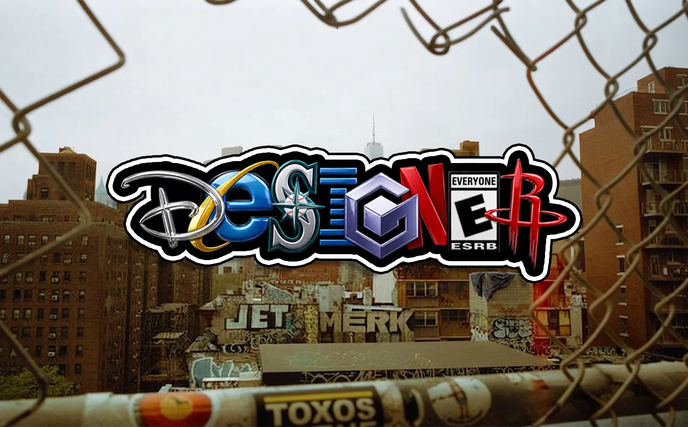
Una tipografía personalizada basada en logos de marcas conocidas,
la cual permite crear cualquier nombre combinando diferentes logos.
Durante el proceso de creación se permite ajustar
tamaños, posiciones y orden de elementos, para conseguir el mejor resultado posible.